Shop our STORE and SAVE!!!
Building a Book Cover - Designing the Visual Heart of Your Story
Dive into the elements of building a great eye-catching book cover using these three design elements!
BEHIND THE BOOKS
Charissa Stastny
11/5/20265 min read


Before a reader turns the first page, before they fall in love with the dialogue, and long before they reach the happy ending, they make a connection with a story through a single visual moment: the book cover.
As an indie author and publisher at Tangled Willow Press, I am often asked what goes into making a book cover. Is it just picking a pretty picture? Selecting a fun font?
In reality, a book cover is your story’s very first ambassador. It's a delicate balance of art, psychology, and branding designed to capture the emotional essence of your story inside. Here's a look behind the scenes at how I bring the visual heart of my books to life!
1. Setting the Emotional Tone
A great cover doesn't summarize the plot—it promises an emotion.
When designing covers for my romance titles (like The Ruled Out Romances), every color choice and visual element signals the flavor of love story inside. Warm pastels and soft lighting invite readers into a cozy, heartwarming world, while sharp contrasts create tension and anticipation. The cover tells your heart what to expect long before your mind processes the text.
2. Typography with Personality
Fonts carry their own secret language!
Romance & Fiction: Flowing scripts, hand-drawn lettering, or bold sans-serifs convey intimacy, playfulness, or contemporary charm.
Children’s Books: For my Tumbleberry Tales, the typography needed to be clear, inviting, and playful to match the whimsical meter and rhythm of the adventures inside.
Title Fonts: These are often custom-placed and can be framed with thematic elements—like trailing willow branches or desert blooms—to weave the text directly into the artwork.
3. Layering the Story's Heart
Your background and character art serve as anchors. Whether it’s a charming city skyline or a dark, mysterious lake at dusk, the background you choose will help portray emotion and reveal to readers a sense of what kind of story is inside.
For characters, I've used a shy little penguin working up courage to confront her friends on a children's book, or I've featured a cute couple holding hands to signal a heartwarming romance. The cuteness or non-cuteness of your characters will reveal what kind of story you've written, so choose them carefully.
Remember: you want the focal image on your cover to give readers a tangible piece of the story's world to hold onto.
Bringing It All Together
Now, let's bring all those elements together to show how they work on some real covers.
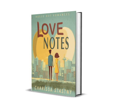
Case Study 1: Love Notes (Ruled Out Romances)
Emotion: The warm golden heart-sun setting instantly signals a sweet, uplifting, and comforting romance. The soft yellow and warm teal palette tells the reader they are in for a heartwarming story with a guaranteed happy ending.
Fonts: The bold, slightly rounded lettering of "LOVE NOTES" feels playful, accessible, and friendly. This novel matches that. The clean sans-serif font for my author name at the bottom grounds the design, while the series title "Ruled Out Romances" across the top creates visual cohesion.
Artwork: The stylized, illustrated figures holding hands against a Seattle skyline give a clear nod to a contemporary setting (featuring iconic landmarks like the Space Needle). Placing the couple in front of the glowing heart silhouette subtly reinforces the theme of finding a safe sanctuary and connection amidst a busy world.

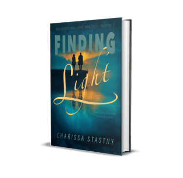
Case Study 2: Finding Light (Bending Willow Trilogy)
Emotion: The deep teal tones of the water and sky paired with a golden sunset convey high drama, emotional depth, and hope after a storm. The contrast between the dark shadows and brilliant light tells the reader this story explores heavier themes of endurance, healing, and overcoming darkness.
Fonts: The typography uses a striking dual-font contrast. The blocky, atmospheric text for "FINDING" feels grounded and steady, while the flowing, handwritten script of "Light" cuts through the dark background like a beam of sunshine, visually modeling the journey toward hope described in the tagline ("Love is the only way out of darkness").
Artwork: The silhouette of two figures standing on a dock over calm water reflects themes of resilience, quiet strength, and deep emotional growth. The glowing reflection on the water anchors the eye, pulling the reader directly into the emotional heart of the story.

Case Study 3: Pia the Peacemaker (Tumbleberry Tales)
Emotion: Bright and full of joyful curiosity! The cool blues and soft grays of the rocky, mountainous coastal background of New Zealand instantly establish a unique, real-world habitat, while Pia’s wide, cheerful smile gives children an immediate feeling of warmth and safety, promising a story filled with heart, resolution, and gentle guidance.
Fonts: The typography is playful, bouncy, and child-friendly. Mixing soft orange outlining on "PIA" with energetic, alternating blue lettering for "PEACEMAKER" gives the title a rhythmic, musical movement across the page—mirroring the rhyming meter inside. The gold badge font clearly highlights the core SEL theme ("The Power of Peacemaking") so parents and educators know the heart of the lesson at a glance.
Artwork: The cute character illustration brings Pia front and center, creating direct eye contact that draws young readers into her world. The detailed, textured environment—from the mossy coastal rocks to the icy peak in the distance—anchors the geography and biome setting. It balances educational exploration with an endearing, animal-led story that little readers can connect with.


Designing a cover is a labor of love. It requires stepping back from your manuscript and asking: If this story were a single visual home, what would it look like?
When the visual elements, fonts, and emotional color palette align, the cover becomes more than just nice packaging—it becomes a bridge between the author's heart and the reader's imagination.
What about you? Have you ever bought a book simply because you fell in love with the cover? What's one of your all-time favorite book covers?
Since our website blog doesn't have a public comment section, I’d love to hear your thoughts directly! If you're a newsletter subscriber, reply to your latest email and let me know which covers catch your eye.
Not on the list yet? Sign up on my homepage here to join our cozy community, and let's keep the conversation going!